External Paint Colour Scheme
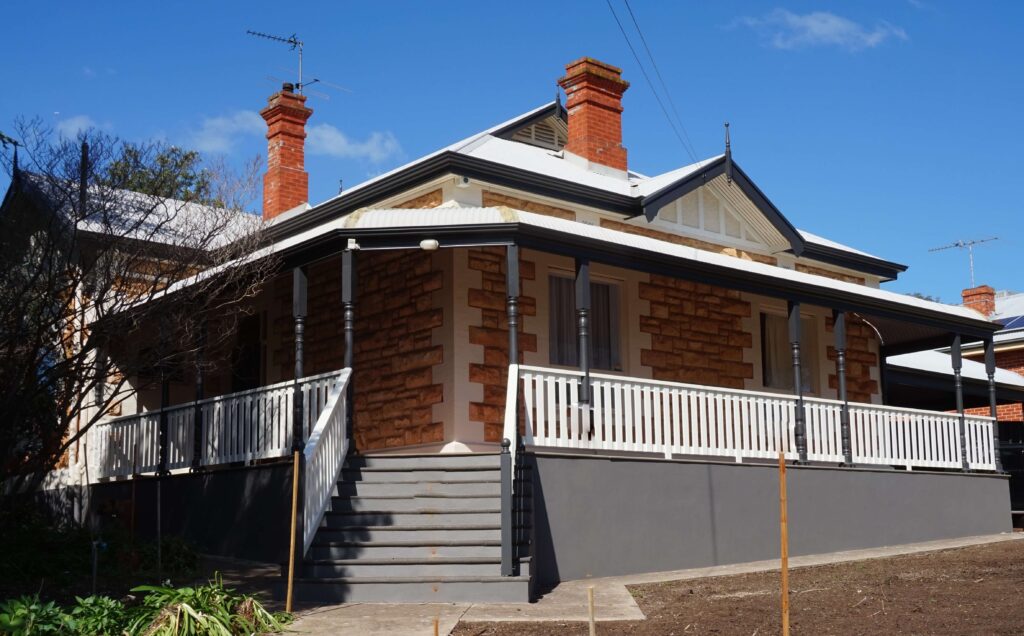
Our clients are always amazed at how a change of colour can change the way they perceive the exterior of their home or business. It can take an old drab building and make it look fresh clean and inviting. When consideration is given to landscaping, rendered planter boxes, decking or fence’s it can totally transform and complement’s the house or business façade. Our aim is to make our client’s a smile every time they pull into their driveway.
Check out our portfolio on the website, or on Facebook to see more before and after shots that I have captured.
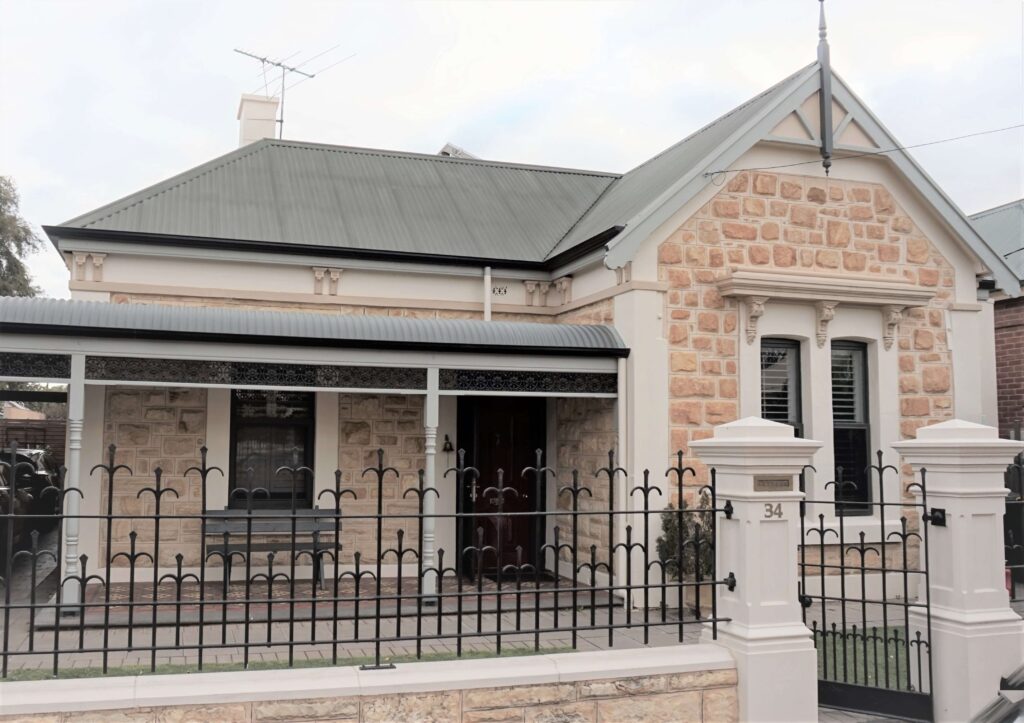
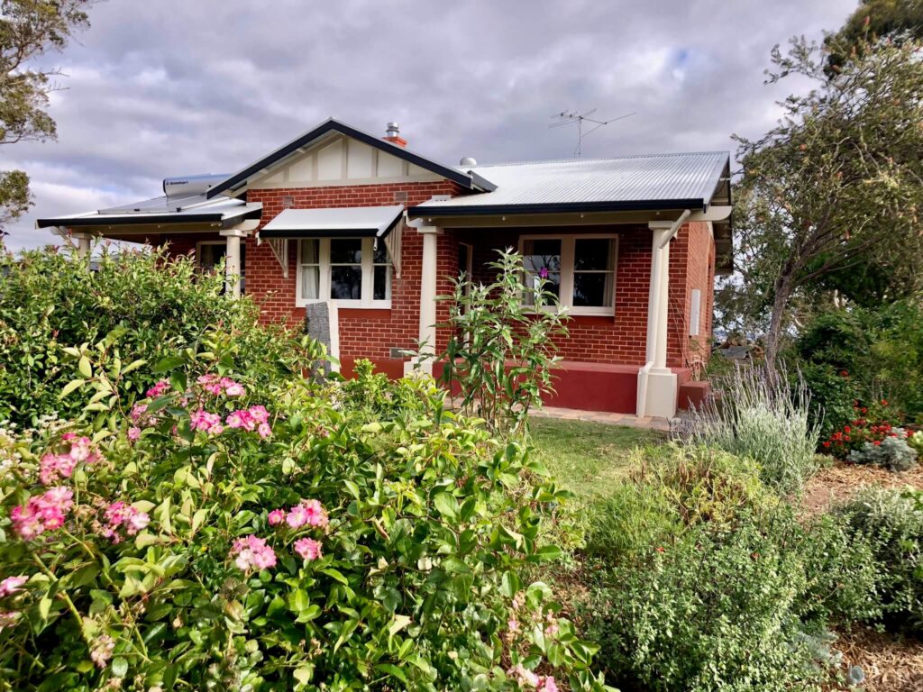
There is a lot to consider when selecting colours for the external of a property. The first is often what the building is constructed from. Its age is another area that needs to be considered. Whether there are building elements where the colours need to be front of mind. Elements such as Colorbond roofing and guttering, traditional roofing, cladding, roller doors or fencing. Whether it is a stone building, it has large areas of glazing or feature brick. Sometimes it’s an area that has been previously painted that you want to work with and enhance. For example it could be the barge boards or the gutters.
Every home or business premises is different even when they are of the same architectural period. Many different things can come into play when selecting colours for the external. The buildings orientation, the amount of large trees, whether the building is elevated or sunken from the road level. This can make the roof more dominate or less dominate.
Styles of home whether old or new have different elements to consider. If the property is old it may have expose beams and purlins, or stone has been used in selected areas. If the building is new it tends to have more blocks of colour which need to be balanced to give a harmonious colour scheme.
Colour schemes for businesses are often treated slightly differently. We still have the same consideration as for a home, but with the main difference being that business logos and corporate colours often come into play. Brighter colours are often used to draw attention. Places like child care centres may have bright coloured doors to identify different areas and rooms like the kindergarten or the baby’s room. Whereas a doctors may have a more calming colours. It is not always the features of the building that are highlighted but areas where logos, business names and identifiable places are featured.
We are lucky to have councils that want to protect the heritage of our street scapes. But for some this can be a problem working within the restraint of council restrictions. But it needn’t be, some of the heritage colour from the Solver fan deck can still give a “modern look,” it doesn’t have to be just green and red like you can often see.
- The colours are chosen inside which effects the colour outside
- The colour sample is laid flat, rather than holding it parallel to the wall for example
- Not enough contrast between colours
- The balance between colours is wrong
People often consider painting their homes when getting them ready for sale. We can advise on a colour scheme that is popular at the time, the aim is to appeal to as many potential buyers as possible. When painting a home for sale it has to be without personal bias. Otherwise you might have people that can’t see past the burnt orange windows and doors.
Testimonials
I would recommend Kim Pavli without hesitation to anyone interested in achieving harmony with either their interior or exterior decor. Kim's approach is to attune herself with her client's style and lifestyle. Asking questions about the areas requiring a change as well as what one is trying to achieve. She then works through the colour options and presents various colour schemes to choose from whilst considering size of area, play of light and also taking in to consideration elements in a room that are not going to change. Kim listened to my ideas and y narrowing down the options to the colour family I was interested in we then found the perfect hue in that for our colour scheme. I am so pleased with the results and love the colours in my home both inside and out. They are just what I wanted and Kim was able to provide the exact shades that create harmony throughout. I am impressed with the level of Kim's professionalism combined with her down to earth style of giving decorating advice.
Thanks Kim! I would like to let you know I love the wall colour you chose for us in our new home. It's warm and inviting and it is much appreciated.
I had the pleasure of working with Ms Pavli on the renovations of my kitchen. She provided colour consulting assistance for all aspects of the kitchen and also selected paint colours for the kitchen and adjoining dining room, lounge room and hallway. During our involvement with Ms Pavli in regards to our renovations we found her extremely helpful and professional. She listened to our ideas and needs, skilfully melded competing and different ideas that my husband and I had, and produced an outcome we were delighted with. I would not hesitate in employing her skills again and have recommended her to others!
I just thought I would let you know that our house has been painted with the colours you suggested. It looks amazing! Thank you so much. For economical reasons we didn't go with the wallpaper around the fireplace but a whitewash effect instead and it all looks great! Thank you again!
The paintwork at our house is almost finished and we are absolutely thrilled with the colour choice. Thank you for your ongoing support in choosing the colours.
